ProTable
ProTable combines the power of Antd ProTable with ModalForm, adding built-in delete and export features. It's designed for real-world admin scenarios where you need full CRUD functionality out of the box.
New to ProTable? No worries! The examples below will walk you through everything step by step.
Building Your First CRUD Table
Here's a complete CRUD table with search, create, edit, and delete functionality. If you're seeing ProTable for the first time, some of the APIs might look unfamiliar - that's totally normal! We'll break everything down into simple, digestible pieces.
| Username | Phone | Nickname | Gender | Created At | Actions | |
|---|---|---|---|---|---|---|
暂无数据 | ||||||
Fetching Data
The magic starts with the request property. Just pass in a function that fetches your data, and ProTable automatically handles pagination, searching, and table refreshing. Your request function should return a promise (like an axios call) with data in this format:
// Your API should return data like this:
{
  data: [], // Array of table rows
  success: true,
  total: 6 // Total count for pagination
}
<ProTable
  request={(params) => requestApi(params)}
  ...
/>
ProTable automatically passes pagination and search parameters to your request function:
{
  current: 2,        // Current page number
  pageSize: 5,       // Items per page
  name: "John",      // Search field values
  // ... other search fields
}
You can either design your backend API to match this format, or transform the parameters in your request function.
| Username | Phone | Nickname | Gender | Created At |
|---|---|---|---|---|
暂无数据 | ||||
Adding Create Functionality
Now let's add a "Create" button. ProTable has designated areas for different types of buttons, which keeps your tables organized and user-friendly. You just need to put buttons in the right spots!
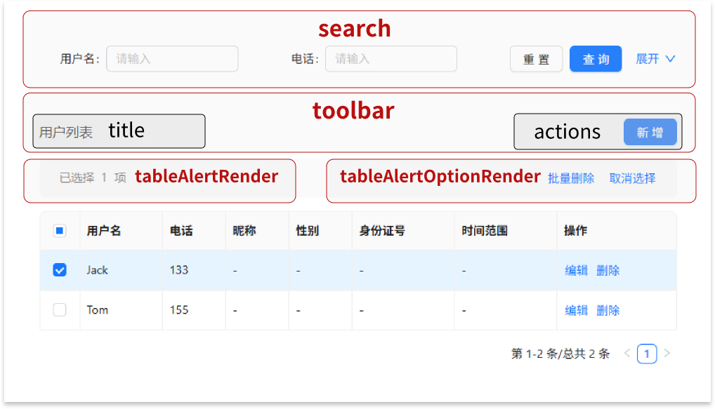
The red labels show the main areas, and black labels show sub-areas within them. For a "Create" button, the best place is in the actions area within the toolbar (you could also put it in the title area).
<ProTable
  toolbar={{
    actions: [
      <Button
        key={1}
        type="primary"
      >
        Create
      </Button>,
    ],
  }}
Once you have the button, use innerRef.current.openModal() to open the create form.
<ProTable
  innerRef={innerRef}
  toolbar={{
    actions: [
      <Button
        key={1}
        type="primary"
        onClick={() => innerRef.current.openModal()}
      >
        Create
      </Button>,
    ],
  }}
Finally, add an onFinish handler to save the new record.
<ProTable
  columns={getColumns()}
  request={mockRequest}
  pagination={{ pageSize: 5 }}
  innerRef={innerRef}
  toolbar={{
    actions: [
      <Button
        key={1}
        type="primary"
        onClick={() => innerRef.current?.openModal()}
      >
        Create
      </Button>,
    ],
  }}
  onFinish={async (values, formType) => {
    if (formType === 'new') {
      await mockAdd(values);
      message.success('Created successfully');
      actionRef.current?.reload(); // Refresh the table after creating
    }
  }}
/>
| Username | Phone | Nickname | Gender | Created At |
|---|---|---|---|---|
暂无数据 | ||||
Adding Edit Functionality
To add editing, we need an "Actions" column with an "Edit" button for each row.
// columns
{
  title: 'Actions',
  valueType: 'option', // 'option' means this is an actions column
  render: (text, record, index, actionRef, innerRef) => [
    <LinkButton
      key={1}
      onClick={() => innerRef.current?.openModal('edit', record)}
    >
      Edit
    </LinkButton>,
  ],
},
When valueType is option, ProTable automatically provides the innerRef parameter to your render function. Use it to open the edit modal with the row's data pre-filled.
Now let's handle the update logic in onFinish:
<ProTable
  ...
  onFinish={async (values, formType, formData) => {
    if (formType === 'new') {
      await mockAdd(values);
      message.success('Created successfully');
      actionRef.current?.reload();
    }

    if (formType === 'edit') {
      await mockUpdate({ ...values, id: formData.id });
      message.success('Updated successfully');
      actionRef.current?.reload();
    }
  }}
/>
Notice on line 11: we need the record's ID for the update API, but the form values don't include it.
Here's the trick: onFinish gets three parameters:
values- the form data the user enteredformType- whether it's 'new' or 'edit'formData- the original record data (including the ID!)
The formData is the same record you passed to innerRef.current?.openModal('edit', record).
| Username | Phone | Nickname | Gender | Created At | Actions |
|---|---|---|---|---|---|
暂无数据 | |||||
Adding Delete Functionality
Delete works just like the request property - simple and automatic! Just provide a delFunction, and ProTable handles both bulk delete and individual row delete.
Your delete function should return a promise and will receive an array of IDs for the selected rows.
For bulk delete, you'll also need to enable row selection:
<ProTable
  ...
  delFunction={mockDetroy}
  rowSelection={{}}
/>
Individual row delete buttons are hidden by default (to save space), but you can enable them per column:
// columns
{
  title: 'Actions',
  valueType: 'option', // valueType set to option represents an action column
  render: (text, record, index, actionRef, innerRef) => [
    <LinkButton
      key={1}
      onClick={() => innerRef.current?.openModal('edit', record)}
    >
      Edit
    </LinkButton>,
  ],
  // Simple enable/disable
  enableDelete: true,
  // Or customize the delete button
  enableDelete: () => ({
    disabled: true,
    visible: true,
    danger: true,
    btnText: 'Close'
  }),
},
| Username | Phone | Nickname | Gender | Created At | Actions | |
|---|---|---|---|---|---|---|
暂无数据 | ||||||
And that's it - you've built a complete CRUD table! ✨
Key Concepts
valueType
ProTable supports valueType just like SchemaForm, but here it's focused on display formatting. For example, set valueType: 'date' and ProTable will automatically convert timestamps into readable dates.
| date | dateTime | dateRange | money |
|---|---|---|---|
暂无数据 | |||
renderText vs render - What's the Difference?
These two are easy to mix up, so here's the breakdown:
renderText - Similar to Ant Design Table's render, but must return a string. ProTable will add ellipsis, copy icons, and other features around your text.
render - Complete control over the display. The first parameter is dom (not text), which already includes ellipsis and copy icons that you can use or replace.
| Username | Phone |
|---|---|
暂无数据 | |
Configuring the Search Area
Control which columns appear in the search form:
{
  title: 'Nickname',
  dataIndex: 'nickName',
  hideInSearch: true, // Don't show in search
  search: false, // Same as above
}
Or disable search entirely:
<ProTable search={false} />
You can also customize search behavior:
<ProTable
  search={{
    labelWrap: true, // Wrap long labels
    defaultCollapsed: false, // Start expanded
  }}
/>
| Username | Phone | Nickname | Gender | Created At |
|---|---|---|---|---|
暂无数据 | ||||
Using type to Control Column Placement
ProTable uses the same column definitions for the table, search form, and edit form. Instead of using multiple hideIn* properties (which gets confusing), you can use the type field to specify exactly where a column should appear:
{
  title: 'Search Only Field',
  type: 'search'  // Only appears in search form
}
Available types: 'form' | 'table' | 'search'
Note:
typehas the highest priority and overrideshideInSearchandsearch: false
You can also set a global default with defaultHideInSearch to control whether columns appear in search by default.
| Username | Create Date | Actions |
|---|---|---|
暂无数据 | ||
Making Search Fields Depend on Each Other
| User | Nickname |
|---|---|
暂无数据 | |
Controlled Table
Don't want automatic data loading? No problem! You can use ProTable like a regular table by providing your own data, while still getting the create and edit features.
| Username | Phone | Actions |
|---|---|---|
| Mr. Wang | 1596668888 |
Exporting Table Data to Excel
ProTable makes Excel export super easy using exceljs. The data formatting is handled for you!
First, install exceljs:
npm i exceljs --save
Then import it:
import * as ExcelJS from 'exceljs';
Export with one command: innerRef.current?.export(rows, ExcelJS)
| Username | Phone | Nickname | Gender | Created At |
|---|---|---|---|---|
暂无数据 | ||||
| Username | Phone | Nickname | Gender | Created At | |
|---|---|---|---|---|---|
暂无数据 | |||||
Customizing Delete Confirmations
| Username | Phone | Nickname | Gender | Created At | Actions | |
|---|---|---|---|---|---|---|
暂无数据 | ||||||
Working with Modals
Customizing Modal Layout
Use modalFormProps to pass any ModalForm properties and customize your modal's appearance.
| Username | Phone | Nickname | Gender | Created At | Actions | |
|---|---|---|---|---|---|---|
暂无数据 | ||||||
Read-Only Modal Mode
Want to show data without allowing edits? Use read-only mode:
innerRef.current?.openModal('read', initialData)
| Username | Phone | Nickname | Gender | Created At | Actions |
|---|---|---|---|---|---|
暂无数据 | |||||
Handling Form Data
Loading Data When Opening Forms
Sometimes you need to fetch additional data when opening an edit form (but not for create). Here's how:
| Username | Phone | Actions |
|---|---|---|
暂无数据 | ||
Convention-Based Data Handling
Just like SchemaForm, ProTable can automatically handle common data transformations based on naming conventions.
| Username | Department | Member | Member Level | Actions |
|---|---|---|---|---|
暂无数据 | ||||
Storing Extra Data with innerRef
Need to pass additional data that's not part of the form? Use innerRef to store and access extra information, just like in SchemaForm.
| Index | Employee | Department | Actions |
|---|---|---|---|
暂无数据 | |||
API
ProTable
ProTable combines our custom properties (ProTableSelfType) with the original Ant Design ProTable properties (ProTableOriginType).
ProTableSelfType
| Property | Description | Type | Default |
|---|---|---|---|
| columns | Configuration description of table or form items; | Required | |
| request | Function to get dataSource; | ((params: any, sort: Record<string, SortOrder>, filter: Record<string, (string | number)[] | null>) => Promise<Partial<RequestData<any>>>) | -- |
| actionRef | Used to manually trigger some table operations, such as reload, reset, etc; | -- | |
| innerRef | A utility ref that contains some methods and properties; | -- | |
| name | Used for table headerTitle display and modal title display; can be used with locale to modify text. | string | -- |
| onFinish | Callback after clicking the modal confirm button; | (values, formType, formData) => Promise | void | -- |
| onOpen | Callback after opening the modal, you can request data here; | (formType, formRef, formData) => Promise | void | -- |
| delFunction | The delete function passed in; | ((selectedIds: (string | number)[], record: any) => void | Promise<any>) | -- |
| delPermission | Whether has delete permission; defaults to true if not passed; | (() => boolean) | -- |
| tableAlertOption | Options for multi-select delete functionality; | -- | |
| tableAlertOptionRender | Custom table alert right area; | false | ((option: { selectedRowKeys: any[]; selectedRows: any[]; onCleanSelected: () => void; }, doms: { delDom?: ReactNode; cancelDom: ReactNode; }) => ReactNode) | -- |
| modalFormProps | Properties passed to the ModalForm component. | Omit<ModalFormProps, 'innerRef' | 'onFinish' | 'onOpen' | 'columns'> | -- |
| noPadding | Remove Card wrapper padding; deprecated; use cardStyle = false instead; | boolean | -- |
| delConfirmType | Type of delete confirmation popup. | "popconfirm" | "modal" | popconfirm |
| delPopconfirmProps | Properties passed to delete confirmation popover. title and description can be functions; | (Omit<PopconfirmProps, "title" | "description"> & { title?: ReactNode | ((record: any, index: any) => ReactNode); description?: ReactNode | ((record: any, index: any) => ReactNode); }) | -- |
| delModalConfirmProps | Properties passed to delete confirmation modal. title and content can be functions; | (Omit<ModalFuncProps, "title" | "content"> & { title?: ReactNode | ((record: any, index: any) => ReactNode); content?: ReactNode | ((record: any, index: any) => ReactNode); }) | -- |
| delSuccessProps | Message properties after successful deletion (passed to Message component). false to disable message. | false | MessageConfig | {content: "删除成功", type: "success"} |
| search | Options for search area; | false | {labelWrap?: boolean} & SearchConfig | -- |
| optionColumnSpaceProps | Properties passed to the Space component that wraps buttons in the action column. | {size: 'small'} | |
| defaultHideInSearch | Whether columns are hidden in search area by default. | boolean | false |
| rakLocale | Used to modify the suffix text of headerTitle and corresponding text for formType, etc. | LocaleType | zh_CH |
| formColumns | Form items in the modal. | FormColumnType[] | columns |
ProTableOriginType
| Property | Description | Type | Default |
|---|---|---|---|
| rowSelection | 选择项配置 | false | (TableRowSelection<any> & { alwaysShowAlert?: boolean; }) | undefined | -- |
| scroll | -- | ({ x?: string | number | true; y?: string | number | undefined; } & { scrollToFirstRowOnChange?: boolean | undefined; }) | undefined | -- |
| classNames | -- | TableClassNamesType<any> | -- |
| styles | -- | TableStylesType<any> | -- |
| indentSize | -- | number | -- |
| title | -- | PanelRender<any> | -- |
| prefixCls | -- | string | -- |
| className | -- | string | -- |
| style | -- | CSSProperties | -- |
| rowKey | -- | string | number | symbol | GetRowKey<any> | -- |
| tableLayout | -- | TableLayout | -- |
| expandable | Config expand rows | ExpandableConfig<any> | -- |
| rowClassName | -- | string | RowClassName<any> | -- |
| footer | -- | PanelRender<any> | -- |
| summary | -- | ((data: readonly any[]) => ReactNode) | -- |
| caption | -- | ReactNode | -- |
| id | -- | string | -- |
| showHeader | -- | boolean | -- |
| components | -- | TableComponents<any> | -- |
| onRow | -- | GetComponentProps<any> | -- |
| onHeaderRow | -- | GetComponentProps<readonly ColumnType<any>[]> | -- |
| direction | -- | Direction | -- |
| sticky | -- | boolean | TableSticky | -- |
| rowHoverable | -- | boolean | -- |
| onScroll | -- | UIEventHandler<HTMLDivElement> | -- |
| measureRowRender | Internal usage, may remove by refactor. | ((measureRow: ReactNode) => ReactNode) | -- |
| dropdownPrefixCls | -- | string | -- |
| dataSource | -- | readonly any[] | -- |
| pagination | -- | false | TablePaginationConfig | -- |
| loading | -- | boolean | SpinProps | -- |
| size | -- | SizeType | -- |
| bordered | -- | boolean | -- |
| locale | -- | TableLocale | -- |
| rootClassName | -- | string | -- |
| onChange | -- | ((pagination: TablePaginationConfig, filters: Record<string, FilterValue | null>, sorter: SorterResult<any> | SorterResult<...>[], extra: TableCurrentDataSource<...>) => void) | -- |
| getPopupContainer | -- | GetPopupContainer | -- |
| sortDirections | -- | SortOrder[] | -- |
| showSorterTooltip | -- | boolean | SorterTooltipProps | -- |
| virtual | -- | boolean | -- |
| toolbar | ListToolBar 的属性 | ListToolBarProps | -- |
| ghost | 幽灵模式,即是否取消卡片内容区域的 padding 和 卡片的背景颜色。 | boolean | -- |
| params | request 的参数,修改之后会触发更新 | any | -- |
| columnsStateMap | 列状态配置,可以配置是否浮动和是否展示 | Record<string, ColumnsState> | -- |
| onColumnsStateChange | 列状态配置修改触发事件 | ((map: Record<string, ColumnsState>) => void) | -- |
| columnsState | 列状态的配置,可以用来操作列功能 | ColumnStateType | -- |
| onSizeChange | -- | ((size: DensitySize) => void) | -- |
| cardProps | table 外面卡片的设置 | false | CardProps | -- |
| tableRender | 渲染 table | ((props: ProTableProps<any, any, "text">, defaultDom: Element, domList: { toolbar: Element; alert: Element | undefined; table: Element | undefined; }) => ReactNode) | undefined | -- |
| tableViewRender | 渲染 table 视图,用于定制 ProList,不推荐直接使用 | ((props: TableProps<any>, defaultDom: Element) => Element) | undefined | -- |
| tableExtraRender | table 和搜索表单之间的 dom 渲染 | ((props: ProTableProps<any, any, "text">, dataSource: any[]) => ReactNode) | -- |
| searchFormRender | 渲染搜索表单 | ((props: ProTableProps<any, any, "text">, defaultDom: Element) => ReactNode) | -- |
| postData | 对数据进行一些处理 | any | -- |
| defaultData | 默认的数据 | any[] | -- |
| formRef | 操作自带的 form | MutableRefObject<ProFormInstance> | undefined | -- |
| toolBarRender | 渲染操作栏 | false | ((action: ActionType, rows: { selectedRowKeys?: (string | number)[] | undefined; selectedRows?: any[] | undefined; }) => ReactNode[]) | undefined | -- |
| optionsRender | -- | ((props: ToolBarProps<any>, defaultDom: ReactNode[]) => ReactNode[]) | -- |
| onLoad | 数据加载完成后触发 | ((dataSource: any[]) => void) | -- |
| onLoadingChange | loading 被修改时触发,一般是网络请求导致的 | ((loading: boolean | SpinProps) => void) | undefined | -- |
| onRequestError | 数据加载失败时触发 | ((e: Error) => void) | -- |
| polling | 是否轮询 ProTable 它不会自动提交表单,如果你想自动提交表单的功能,需要在 onValueChange 中调用 formRef.current?.submit() | number | ((dataSource: any[]) => number) | -- |
| tableClassName | 给封装的 table 的 className | string | -- |
| tableStyle | 给封装的 table 的 style | CSSProperties | -- |
| headerTitle | 左上角的 title | ReactNode | -- |
| tooltip | 标题旁边的 tooltip | LabelTooltipType | -- |
| options | 操作栏配置 | false | OptionConfig | -- |
| dateFormatter | 暂时只支持 dayjs - string 会格式化为 YYYY-DD-MM - number 代表时间戳 | false | "string" | "number" | (string & {}) | ((value: Dayjs, valueType: string) => string | number) | -- |
| beforeSearchSubmit | 格式化搜索表单提交数据 | ((params: Partial<any>) => any) | -- |
| tableAlertRender | 设置或者返回false 即可关闭 | AlertRenderType<any> | -- |
| type | 支持 ProTable 的类型 | ProSchemaComponentTypes | -- |
| onReset | 重置表单时触发 | (() => void) | -- |
| columnEmptyText | 空值时显示 | ProFieldEmptyText | -- |
| manualRequest | 是否手动触发请求 | boolean | -- |
| editable | 编辑行相关的配置 | RowEditableConfig<any> | -- |
| onDataSourceChange | 可编辑表格修改数据的改变 | ((dataSource: any[]) => void) | -- |
| cardBordered | 查询表单和 Table 的卡片 border 配置 | Bordered | -- |
| debounceTime | 去抖时间 | number | -- |
| revalidateOnFocus | 只在request 存在的时候生效,可编辑表格也不会生效 | boolean | false |
| defaultSize | 默认的表格大小 | SizeType | -- |
| ErrorBoundary | 错误边界自定义 | false | ComponentClass<any, any> | -- |
InnerRefType
| Property | Description | Type | Default |
|---|---|---|---|
| params | Query parameters. | any | -- |
| total | Total count. | number | -- |
| dataSource | Table data source. | any | -- |
| export | Export table data. | (rows: any, ExcelJS: any, options?: { beforeExport?: ((worksheet: any) => void) | undefined; filename?: string | undefined; } | undefined) => void | Required |
| openModal | Used to open the modal; formType can be used to determine the form type in onFinish; | (formType?: FormType | undefined, initialValues?: object | null | undefined, cb?: (() => void) | undefined) => void | Required |
| formType | Current form type | FormType | -- |
| data | Can store some additional data | Record<string, any> | Required |
| setData | Store data; setData works like React's setState, you only need to pass in the fields you care about, and it won't overwrite other fields. | (values: Record<string, any>) => void | Required |
TableAlertOptionType
| Property | Description | Type | Default |
|---|---|---|---|
| enableDelete | Whether to enable delete on alert | boolean | ((selectedRowKeys: any[], selectedRows: any[]) => boolean | EnableDeleteType) | true |
| delPopconfirmProps | Properties passed to the delete confirmation popover on alert. title and description can be functions; | (Omit<PopconfirmProps, "title" | "description"> & { title?: ReactNode | ((selectedRowKeys: any[], selectedRows: any[]) => ReactNode); description?: ReactNode | ((selectedRowKeys: any[], selectedRows: any[]) => ReactNode); }) | -- |
| delModalConfirmProps | Properties passed to the delete confirmation modal on alert. title and content can be functions; | (Omit<ModalFuncProps, "title" | "content"> & { title?: ReactNode | ((selectedRowKeys: any[], selectedRows: any[]) => ReactNode); content?: ReactNode | ((selectedRowKeys: any[], selectedRows: any[]) => ReactNode); }) | -- |
| spaceProps | Properties passed to the Space component that wraps buttons in the alert. | {size: 'middle'} |
TableColumnType
Since ProTable columns work for both tables and forms, TableColumnType combines properties from TableColumnSelfType, TableColumnOriginType, and FormColumnType.
TableColumnSelfType
| Property | Description | Type | Default |
|---|---|---|---|
| enableDelete | Whether to enable delete in the action column | boolean | ((record: any, index: number) => boolean | (EnableDeleteType & { btnIndex?: number; })) | undefined | -- |
| renderExport | Define export | ((text: string | number, record: any) => string | number) | -- |
| render | Inject innerRef into the render method | ((dom: ReactNode, record: any, index: number, action: ActionType, innerRef: InnerRef) => any) | -- |
| type | Used to specify whether this schema is used for form or table | "search" | "form" | "table" | -- |
| children | Nested table | TableColumnType<any, "text">[] | -- |
TableColumnOriginType
| Property | Description | Type | Default |
|---|---|---|---|
| title | 支持 ReactNode 和 方法 | ReactNode | ((schema: ProSchema<any, Omit<ColumnType<any>, "title" | "children" | "render" | "filters" | "onFilter" | "sorter"> & { sorter?: string | boolean | CompareFn<...> | { ...; }; } & { ...; }, ProSchemaComponentTypes, "text", { ...; }>, type: ProSchemaComponentTypes, dom: ReactNode) => ReactNode) | -- |
| className | -- | string | -- |
| sortDirections | -- | SortOrder[] | -- |
| showSorterTooltip | -- | boolean | SorterTooltipProps | -- |
| search | 在查询表单中隐藏 | boolean | { transform: SearchTransformKeyFn; } | -- |
| request | 从服务器请求枚举 | ProFieldRequestData<any> | -- |
| params | 从服务器请求的参数,改变了会触发 reload | Record<string, any> | ((record: any, column: ProSchema<any, Omit<ColumnType<any>, "title" | "children" | "render" | "filters" | "onFilter" | "sorter"> & { ...; } & { ...; }, "form", "text", unknown>) => Record<...>) | -- |
| tooltip | 展示一个 icon,hover 是展示一些提示信息 | LabelTooltipType | -- |
| debounceTime | request防抖动时间 默认10 单位ms | number | -- |
| filters | 表头的筛选菜单项 | boolean | ColumnFilterItem[] | -- |
| onFilter | 筛选的函数,设置为 false 会关闭自带的本地筛选 | boolean | ((value: boolean | Key, record: any) => boolean) | -- |
| sorter | -- | string | boolean | CompareFn<any> | { compare?: CompareFn<any>; multiple?: number | undefined; } | undefined | -- |
| colSpan | -- | number | -- |
| dataIndex | 支持一个数字,[a,b] 会转化为 obj.a.b | any | -- |
| shouldCellUpdate | -- | ((record: any, prevRecord: any) => boolean) | -- |
| rowSpan | -- | number | -- |
| width | -- | string | number | -- |
| minWidth | -- | number | -- |
| onCell | -- | GetComponentProps<any> | -- |
| onCellClick | Please use `onCell` instead | ((record: any, e: MouseEvent<HTMLElement, MouseEvent>) => void) | -- |
| key | 确定这个列的唯一值,一般用于 dataIndex 重复的情况 | Key | -- |
| hidden | -- | boolean | -- |
| fixed | -- | FixedType | -- |
| onHeaderCell | -- | GetComponentProps<ColumnType<any> | ColumnGroupType<any>> | -- |
| ellipsis | 是否��缩略 | CellEllipsisType | -- |
| align | -- | AlignType | -- |
| rowScope | -- | RowScopeType | -- |
| sortOrder | -- | SortOrder | -- |
| defaultSortOrder | -- | SortOrder | -- |
| sortIcon | -- | ((props: { sortOrder: SortOrder; }) => ReactNode) | -- |
| filtered | -- | boolean | -- |
| filterDropdown | -- | ReactNode | ((props: FilterDropdownProps) => ReactNode) | -- |
| filterOnClose | -- | boolean | -- |
| filterMultiple | -- | boolean | -- |
| filteredValue | -- | FilterValue | null | -- |
| defaultFilteredValue | -- | FilterValue | null | -- |
| filterIcon | -- | ReactNode | ((filtered: boolean) => ReactNode) | -- |
| filterMode | -- | "menu" | "tree" | -- |
| filterSearch | -- | FilterSearchType<ColumnFilterItem> | -- |
| filterDropdownProps | Can cover `<Dropdown>` props | CoverableDropdownProps | -- |
| filterResetToDefaultFilteredValue | -- | boolean | -- |
| responsive | -- | Breakpoint[] | -- |
| tip | -- | string | -- |
| valueEnum | 支持 object 和Map,Map 是支持其他基础类型作为 key | ProSchemaValueEnumObj | ProSchemaValueEnumMap | ((row: any) => ProSchemaValueEnumObj | ProSchemaValueEnumMap) | -- |
| formItemProps | 自定义的 formItemProps | (FormItemProps<any> & { lightProps?: LightWrapperProps; }) | ((form: FormInstance<any>, config: { key?: Key | undefined; ... 19 more ...; proFieldProps?: (ProFieldProps & Record<...>) | undefined; } & ... 4 more ... & { ...; }) => FormItemProps<...> & { ...; }) | undefined | -- |
| renderText | 修改的数据是会被 valueType 消费 | ((text: any, record: any, index: number, action: ProCoreActionType<{}>) => any) | -- |
| dependencies | 依赖字段的name,暂时只在拥有 request 的项目中生效,会自动注入到 params 中 | any[] | -- |
| ignoreFormItem | 忽略 FormItem,必须要和 renderFormItem 组件一起使用 | boolean | -- |
| hideInDescriptions | 在 descriptions 隐藏 | boolean | -- |
| hideInForm | 在 Form 中隐藏 | boolean | -- |
| hideInTable | 在 table 中隐藏 | boolean | -- |
| hideInSearch | 在 table的查询表单 中隐藏 | boolean | -- |
| proFieldProps | 设置到 ProField 上面的 Props,内部属性 | (ProFieldProps & Record<string, any>) | -- |
| index | -- | number | -- |
| colSize | 每个表单占据的格子�大小 | number | -- |
| initialValue | 搜索表单的默认值 | any | -- |
| copyable | 是否拷贝 | boolean | -- |
| hideInSetting | 不在配置工具中显示 | boolean | -- |
| order | Form 的排序 | number | -- |
| listKey | -- | string | -- |
| readonly | 只读 | boolean | -- |
| disable | 列设置的 disabled | boolean | { checkbox: boolean; } | -- |
| valueType | -- | ProFieldValueType | { type: "money"; status?: "normal" | "active" | "success" | "exception"; locale?: string | undefined; showSymbol?: boolean | ((value: any) => boolean) | undefined; ... 4 more ...; width?: number | undefined; } | ... 4 more ... | undefined | -- |
FormColumnType
EnableDeleteType
| Property | Description | Type | Default |
|---|---|---|---|
| disabled | Whether the delete button in the action column is disabled. | boolean | -- |
| visible | Whether the delete button in the action column is visible. | boolean | -- |
| danger | The danger property of the delete button in the action column. | boolean | -- |
| btnText | The text of the delete button in the action column. | string | -- |
Global Events
| Event Name | Description | Note |
|---|---|---|
| @proTableReload | Triggers a table refresh from anywhere in your app using document.dispatchEvent(new Event('@proTableReload')). Useful when you need to refresh a table from a different page - for example, after creating a record on a separate create page. | v1.0.0 |